Decathlon’s (re)brand… capturing nearly 50years of sport.
Watching the slow collapse of the high street has been difficult for a retail fan like myself to see. So when the giant empty unit that once housed BHS in my hometown arcade, was replaced with a Decathlon, a store which looked a little cheap and didn’t speak to my aesthetic preferences, I went in, saw some great products, but ultimately didn’t pay much attention to it.
However, for the french sports giant, after nearly 50 years with no unique brand, have now decided it might be time to address that. With the help of Wolff Olins, a fresh yet recognisable identity has been developed, a new logo, typeface and what feels like a good foundations for a personality. There’s so much about this project I enjoy from the introduction of a logo itself, to the custom font created by foundry Grilli Type, let’s dive in.
THE LOGO
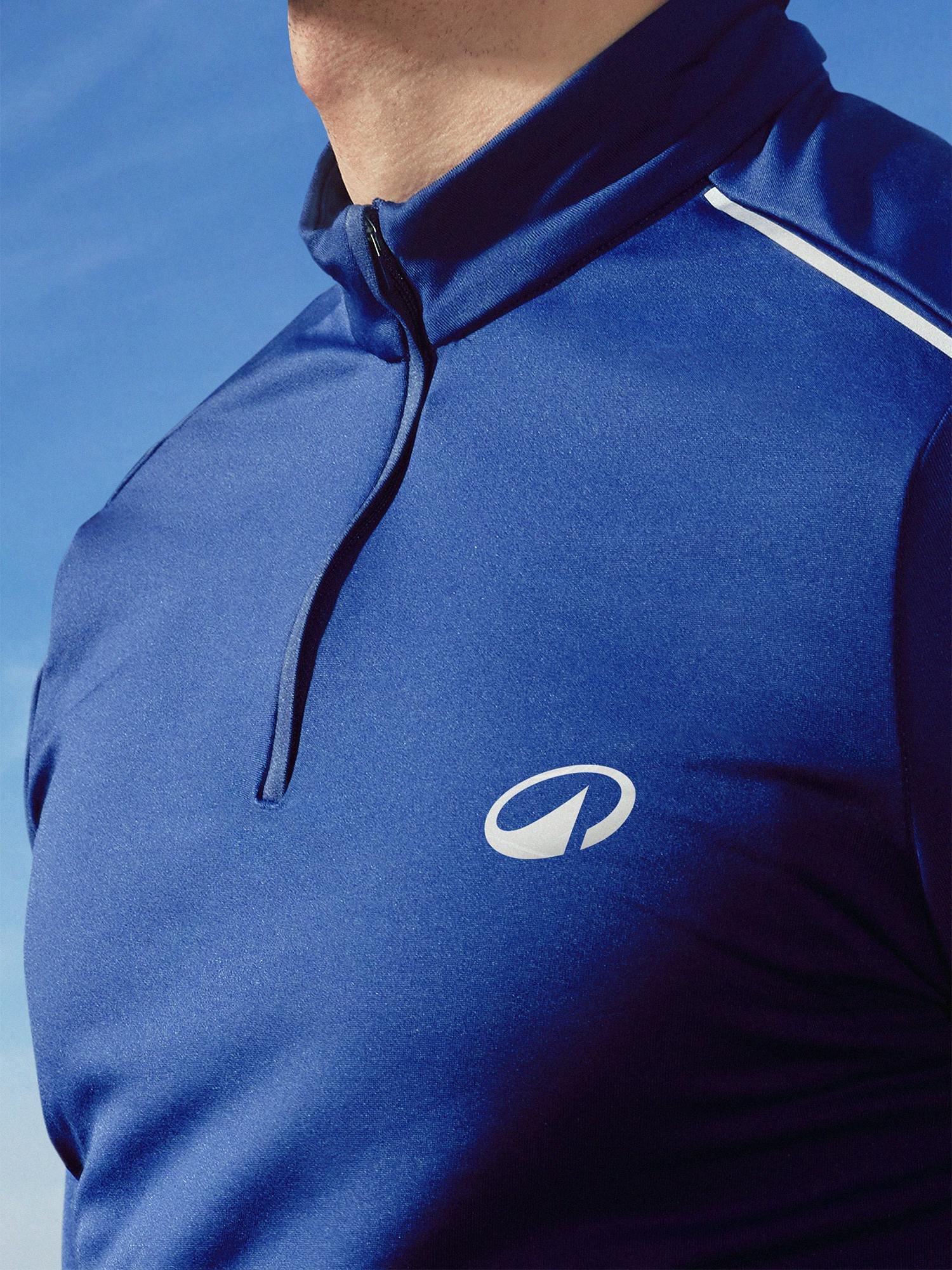
Decathlon’s new mission is ‘to move people through the wonders of sport’, which has been the inspiration for the new logo, referred to as L’Orbit - a graphic representation of a wave, mountain and the circular models that represent the businesses care for the planet. Wolff Olins have created a neat insignia that can be easily recognised across products, print and digital platforms alike.
Speaking to It’s Nice That, Emma Barratt (Global Executive Creative Director, Wolff Olins) explains “[It’s] A mark that was shorthand for what the brand essentially stands for… You’re meant to feel something when you see it,” (absolutely right, logos are inherently opinion forming) she continues, “People have grown up with Decathlon but not exactly desired Decathlon, so this is about becoming a mark of desire too.”
Look how my own attention has immediately been drawn to a business I wasn’t fussed by, now I can start to understand what it stands for - branding has something magic about presenting answers to visual learners, and raising questions that make you want to learn more. L’Orbit is simple and effective and brings immediate brand equity - perfect.
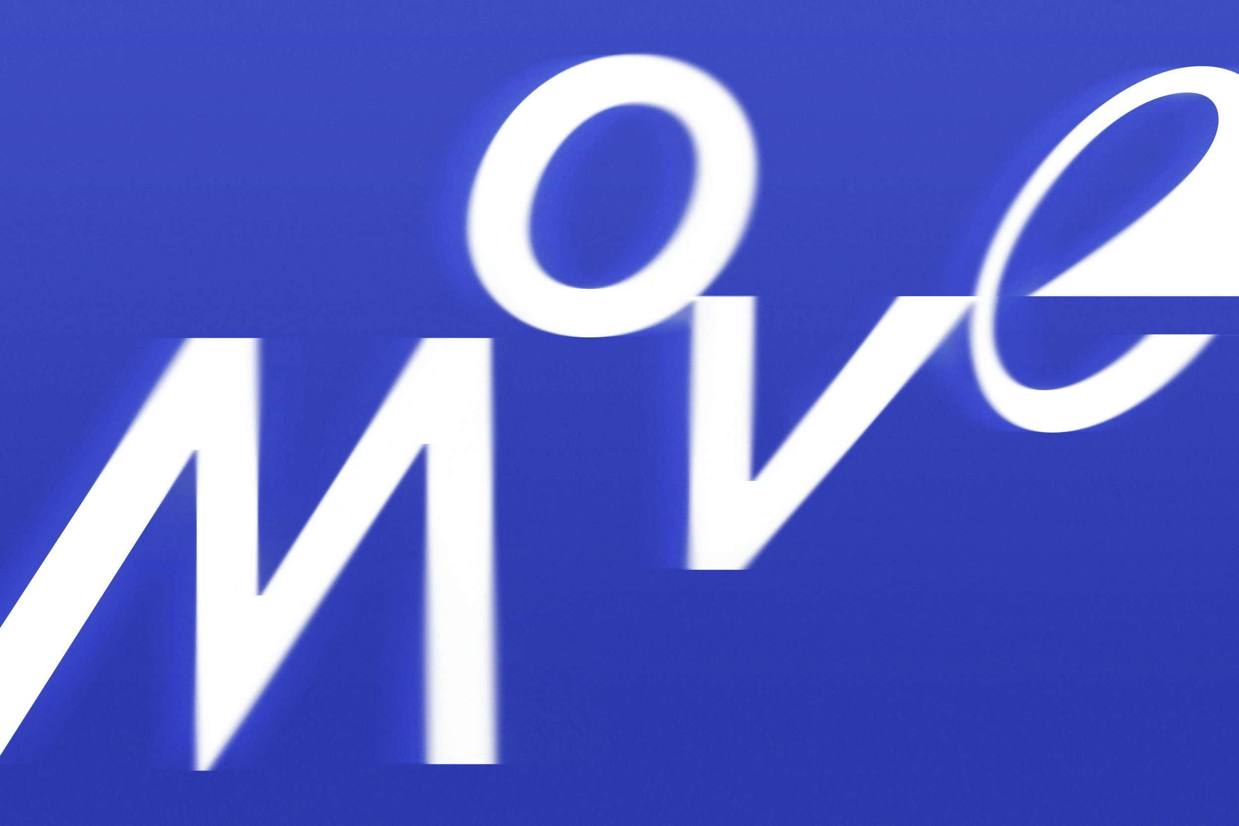
THE TYPEFACE
This was something I was very happy to see. Developed by Grilli Type, the font not only features slants to promote the performance in sports, but also curvatures that reflect L’Orbit, as well as variable options. The branding’s handwriting is described as ‘joyful and wondrous’, which helps open the visuals up to both beginners and more established players alike.
My recent work in creative campaigns for sport also explored the ways in which font can make creative more accessible, drawing inspiration from Dyslexia Scotland’s font project. So maybe I just feel justified in my own creative direction - but we take the wins where we can to keep us going!
THE PRESENTATION
So let’s look at the elements from the global campaign, sister company AMV BBDO, have developed.
Wolff recognised that most global sports brands are all too focused around ‘greatness, glory and perfection’, however developing the wonders in sport was about discovering the role of sport in peoples lives. They found that love for sport is not actually rooted in winning, but the enjoyment and wellness it provides.
Decathlon have always been there to make sport accessible at any level, and this insight pairs beautifully with delivering a brand that sits to represent the masses of people who don’t focus on the outcome, but enjoy the process regardless.
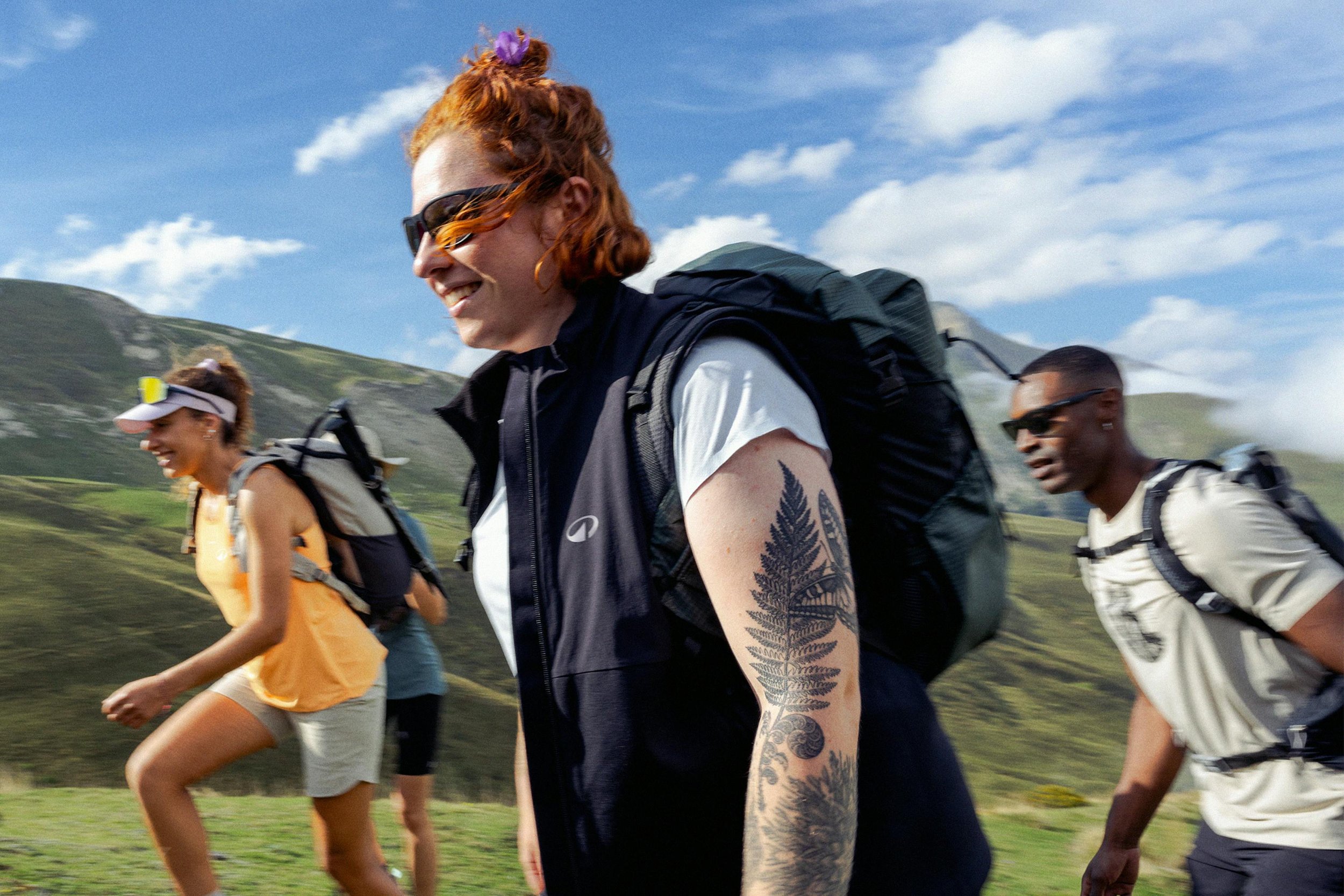
The brand video strikes a good balance of history and the now, some cliche edits used in sport, but that only helps to make things obvious what Decathlon is about. Where the creativity lands beautifully is across digital and OOH where product shots are crisp with graphic animated highlights of features, or clean type used for product names and an obvious CTA to shop online or in store. This simplicity could fail quite easily as uninspiring, but delivered with a beautiful parallax-style movement, it has a depth that feels immersive - a nice touch that anyone can enjoy, another win for accessibility.
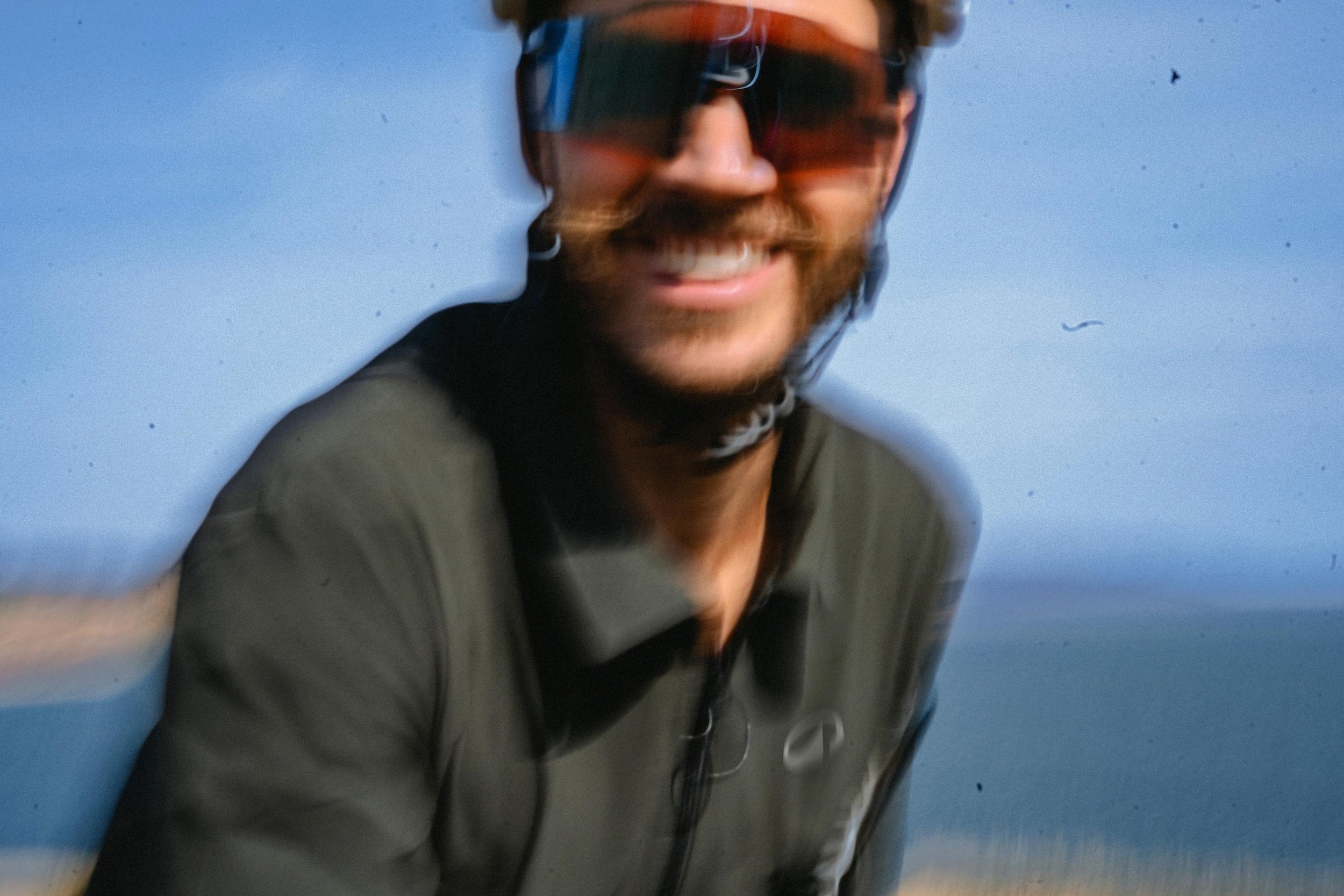
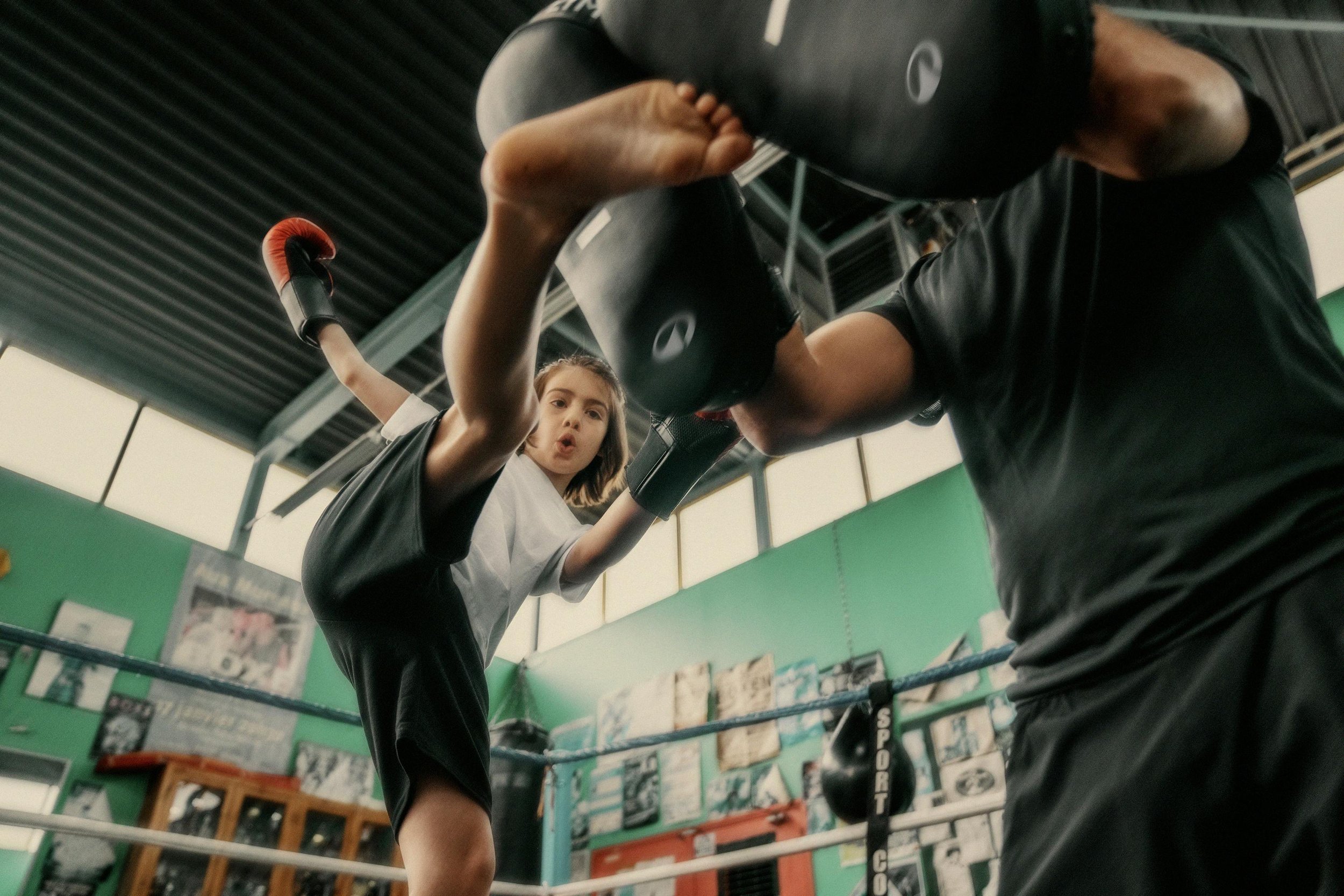
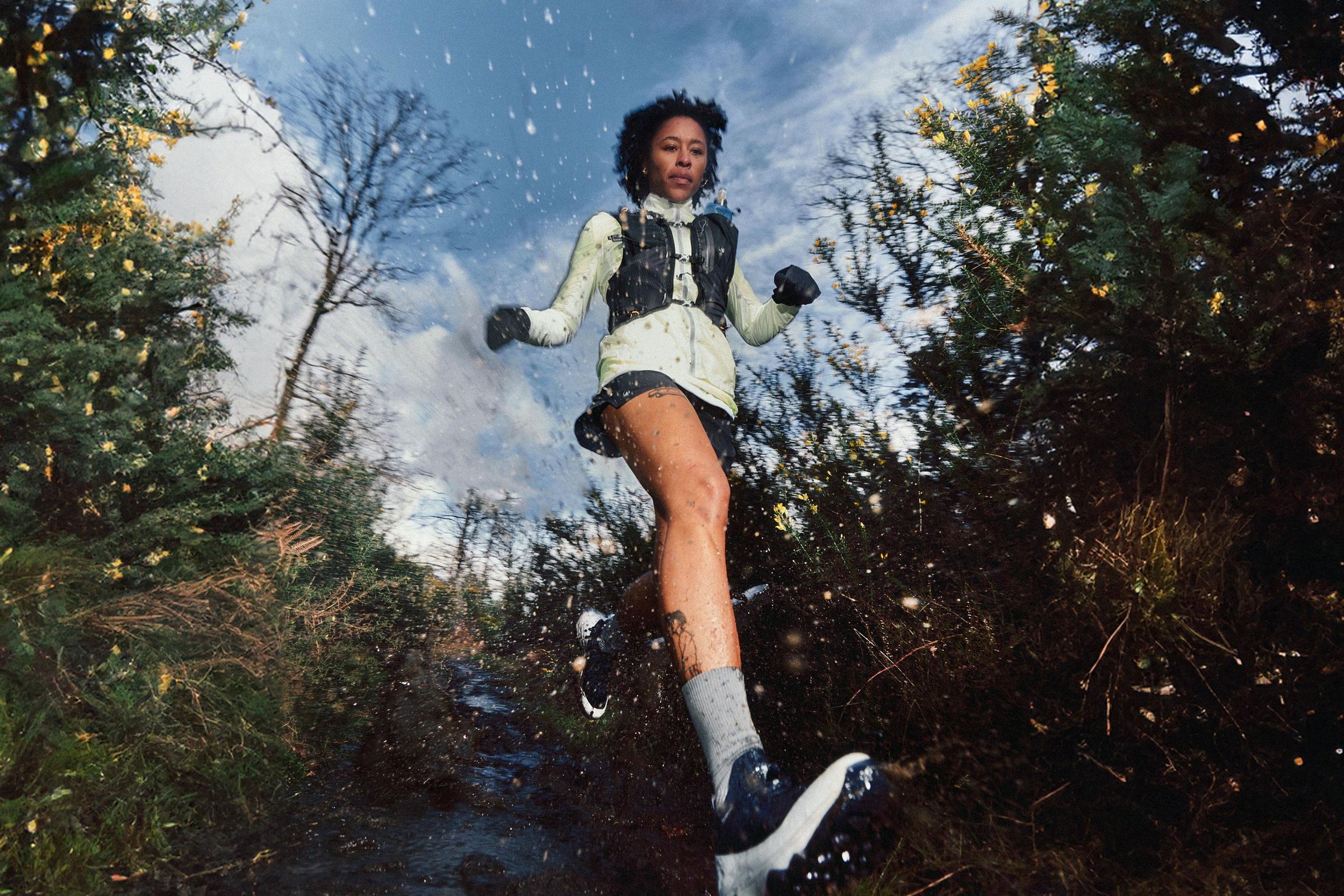
And, when photography isn’t all about crisp product shots, movement remains the theme. Real people enjoying real sport, captured while they move - blurred, smiling, sweating, focused, all proudly showing the new logo, prominent and as real as they are - not shying away from the usual precious nature of distortion that most brand guardians would reject immediately. It speaks to the more documentary style trends of social media photography, less manicured, more realistic.
CONCLUSION
Overall, this is yet another success for the branding giants at Wolff Olins, it feels authentic to the business and needed to cut through a crowded market of fitness lifestyle brands. I’m excited to see how the in store elements start to come together, and wonder if something like community building is the obvious next step for the brand to build its desirable status.
Check out more comments from Emma Barratt in the It’s Nice That article.
Discover the case study and some great context about the branding on Wolff Olins.
All images / visuals are copyright of Decathlon/Wolff Olins